
Responsive design is a term that is used to describe web applications that are designed in a way that makes them display correctly across all types of devices. Responsive websites will look great on any device, regardless of screen size. Mobile devices have increased the demand for responsive web design, which in turn has increased the demand for responsive data visualization.
One of the biggest concerns is responsive images. This has led to the innovation of various tools to ensure that images are displayed correctly across all devices. It has presented the biggest challenge, so it’s no surprise that it’s also become the target of innovation. That brings us to the important topic of data visualization.
What Exactly is Data Visualization?
Data visualization refers to the methods that are used to communicate key information through visuals. In short, large sets of data are gathered and then processed into easily digestible visual graphics. That way, decision-makers can easily distinguish the relationships between different sets of data. It’s an essential part of the whole data analytical process that businesses use.
In business, we use the tools to accomplish this overall goal to make data-driven decisions. Charts are the most common form of data visualization and infographics are starting to become just as popular.

Business intelligence strategies revolve around visual processes. Data visualization provides the best data-driven insights because it’s easier to understand. When leaders need to make important decisions, the last thing they need is data formatted in a way that confuses them. They need to be able to see the patterns associated with data sets.
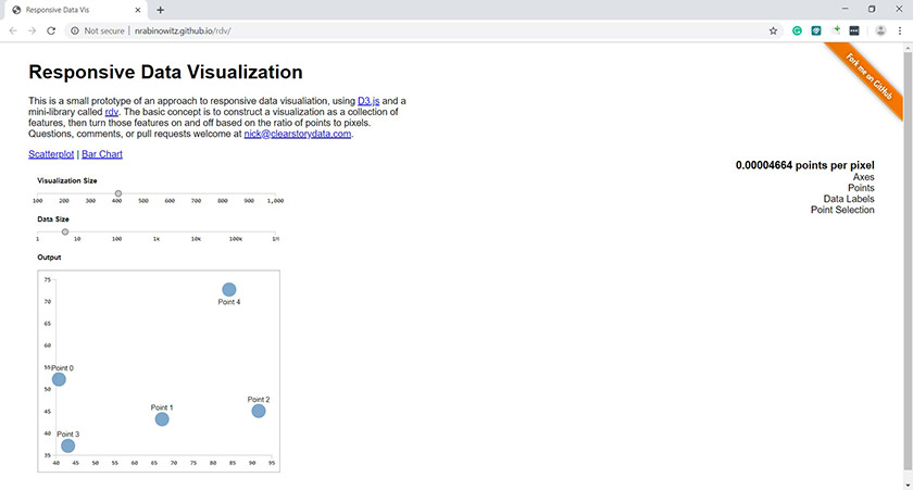
Building Responsive Data Visualization for the Web
When smartphones were first introduced to the world, the trend was for businesses to develop responsive websites to gain a competitive advantage. What was once simply a trend has now become a requirement for business. When developing a website, you have to plan for it to be viewed on a lot of different sized screens. It must be assumed that your website will be viewed across all types of mobile devices – because it will be! This plays a huge role in the rising demand for responsive data visualization, the first step for data analysis.
Incorporate the Principles of Responsive Web Design
The fact that data is growing at such a fast pace has started to create more of a demand for responsive data visualization. But the first step for any business has to be getting all of their websites and online funnels more compatible with mobile devices. With that being said, here are the three most important principles of responsive web design.
- Fluid Grids Designers started using fluid grids, and that quickly became the staple of responsive web design. Fluid grids use percentages to format design so it will increase, and decrease based on the size of the screen.
- Media Queries These are also known as breakpoints for some designers. A website will query the device to determine what is being used and then automatically adjust the website to compensate.
- Flexible Media Images create the greatest challenge for responsive web design, so a process known as scaling is being used to adjust them automatically. When scaling, the media will either shrink or expand to match the requirements of the device being used.
Bridging the Gap Between Responsive Web Design and Data Visualization
Responsive data visualization takes over at the point where responsive web design leaves off. Developers can use the same processes to create apps that are going to respond to the size and complexity of data automatically. Tools like Bootstrap and Viewbox are used by developers to create reusable code that will then automatically connect specific data sets. As datasets change, data visualization will also change so will data analysis.
Responsive data visualization is not about the specific technology being used, though. It’s more about the principles and creativity of the developer in charge of putting it together. One of the main goals for businesses is to have data presented in a professional format across all devices. Some of those flashy designs that look amazing on a computer are going to look like garbage on a mobile device. It’s important to find a balance. Always remember that the most important goal is to present data in a format that is easily digestible across all devices. This is known as mobile data visualization.
The reason we use responsive web design as a comparison here is that the principles used are almost identical. We’re trying to present the same data in the same format across a multitude of devices.
Data Strategies Must be Evolved to Responsive Workflows
Responsive data visualization uses most of the same principles as responsive web design, so when these principles are applied, data must look as if it is designed specifically for the device being used. With that being said, a business looking to transform their responsive design to data will need to change their data perception. Data strategies must be developed to encompass this new mindset. That will include finding new methods of gathering raw data and then formulating some new business intelligence practices to ensure that it’s being funneled into the system in a way that allows for the creation of responsive data visualization. Five important factors must be considered.
#1: Know the Audience
Cookie-cutter methods will not work here since all businesses will depend on different metrics. Creating great visuals always starts with a deep understanding of what it is that needs to be said. Understand your target market so that you know exactly what type of data you need to gather.
#2: Define a Methodology
Once you understand the target market, it’s time to hammer out a process to use in the design of your responsive data visualization system. Only by defining a specific methodology and following through with it, will you be able to ensure that all visuals are met with consistent quality.
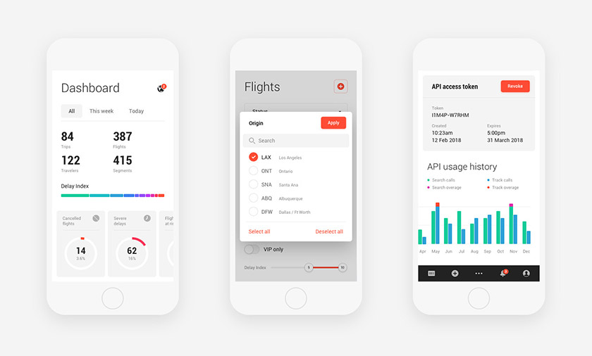
#3: Create a Dashboard
Determine which of the three types of dashboards that you will use in your system.
- Strategic This presents key insights in a minimally interactive manner, delivering a high-quality view of the answer to specific questions.
- Analytical Unlike strategic dashboards, this one is highly interactive to provide contextual views.
- Operational This dashboard is updated more frequently and monitors all process concerns that have to do with the overall operation of a business.
#4: Create a Data Profile
There are a ton of visual features that can be used in responsive data visualization, and each one offers benefits to specific types of data. So this phase requires you to create either an ordinal (ex: bronze, gold, platinum), categorical (ex: Low, Middle, or High Income), or quantitative (ex: $2 million profit, $5 million profit, $10 million profit) data profile.
#5: Design Iteratively
Don’t wait to start visualizing data. Start designing some of the concepts immediately and then revise it as needed. Many businesses will spend so much time analyzing their options that they miss out on valuable opportunities. There is no better time to start than right now.
Final Thoughts
Data visualization web design is where it all begins, but you will have to expand those concepts to your overall data strategy. The overall goal should be to use responsive data visualization to provide better data analysis and a clearer insight for the audience. Data should be easy to understand no matter what device it’s being viewed on.
– Research Optimus
-Research Optimus
 Prev
Prev